Graphic Designer

Hi, I’m Mae.

I design brand identities, packaging, editorial layouts, and web experiences — turning a loose idea into a visual system that holds up everywhere it needs to live. My work draws on logo & identity design, art direction, typography and grid systems, and packaging and print production, built start-to-finish in Adobe Creative Suite. I care about the details most people skip: consistent systems, considered layouts, and files that are actually production-ready.

Based in
United States
Focus
Brand · Editorial · Web/Social
Status
Open to work
01

Web & Social Campaigns

1 Project
02

Branding & Identity

8 Projects
03

Editorial & Print

6 Projects
04

Contact

Let's talk

Got a project in mind? Let's make something worth looking at.

Whether it's a full brand system, an editorial piece, or a site that needs a redesign — I'd love to hear about it.

Currently available

Based in the United States, open to freelance and full-time opportunities in branding, editorial, and digital design.

01 — Web & Social Campaign

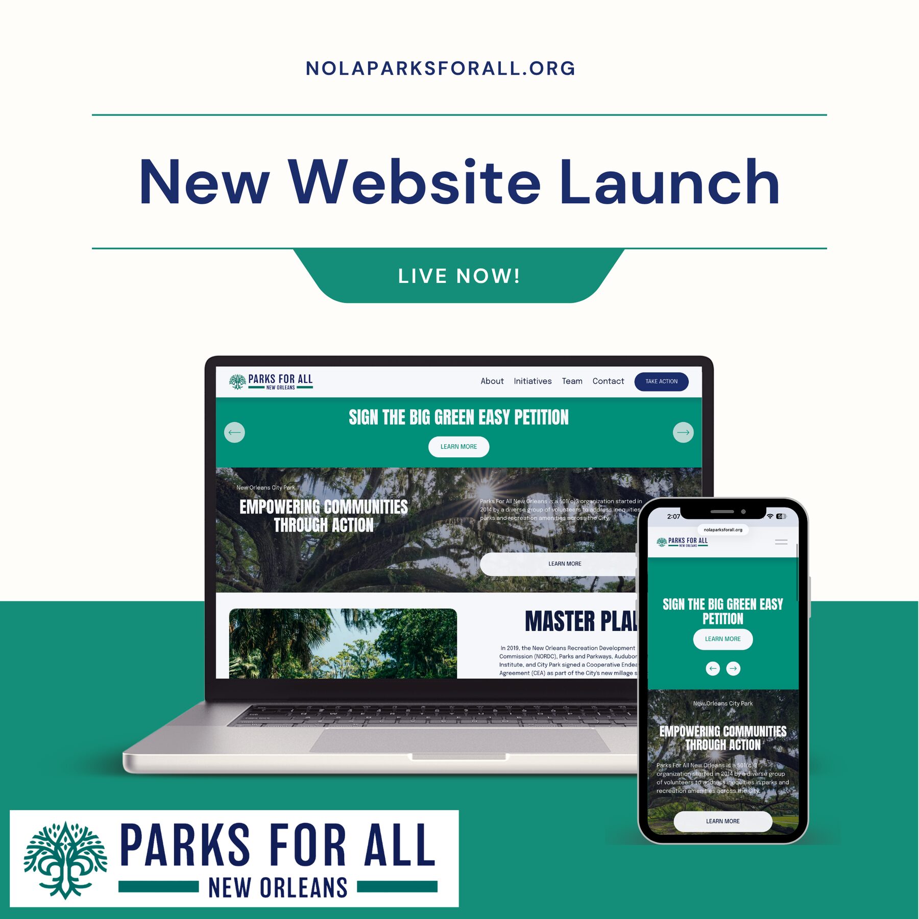
Parks For All

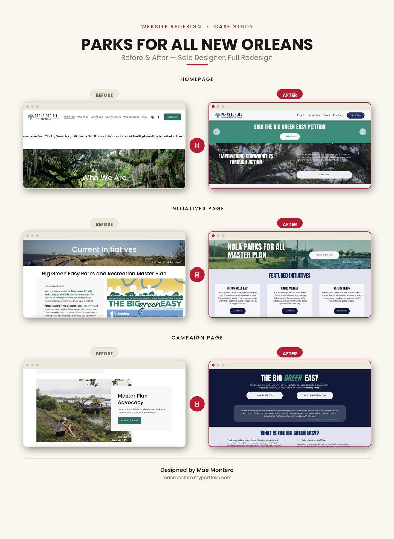
A responsive nonprofit website designed to make New Orleans' park system feel welcoming, browsable, and easy to support.
Category
Web & Social Campaign
Role
Web / UI Design
Deliverables
Site UX/UIBefore/After AuditResponsive Layout
Parks For All website mockup on desktop and mobile
Full site mockup, desktop & mobile

01 The Challenge

NOLA Parks For All works to ensure every neighborhood in New Orleans has access to a safe, well-maintained park. Civic sites like this tend to read as dense and bureaucratic — the goal was to translate a mission about equity and access into a layout people would actually want to explore.

02 The Approach

I built the mockup around large photography, a simplified navigation, and a warmer palette pulled from the parks themselves, then mapped out a full before/after comparison to show stakeholders exactly what was changing and why.

03 The Result

A cleaner, more navigable site structure that puts the mission and the parks front and center, with a clear content hierarchy for programs, park listings, and donations.

Before and after comparison of Parks For All website
Before / after comparison

02 — Brand Identity

P4P Kicks

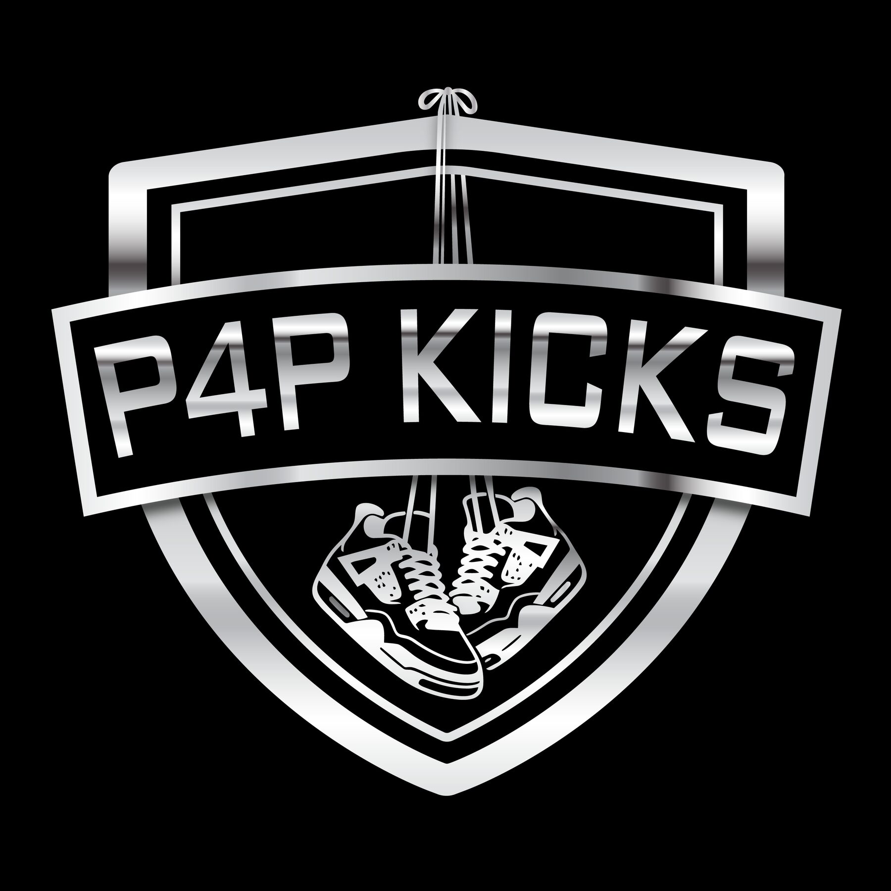
A bold identity system for a sneaker-focused streetwear brand, built to hold its own on a shoebox, a business card, or a hype poster.

Category
Brand Identity
Role
Logo & Brand Design
Deliverables
Logo & WordmarkBusiness CardBrand Mockup
P4P Kicks brand mockup
Primary brand mockup

01 The Challenge

Sneaker and streetwear branding lives or dies on shelf and social presence — the identity had to be distinctive at a glance and flexible across formats.

02 The Approach

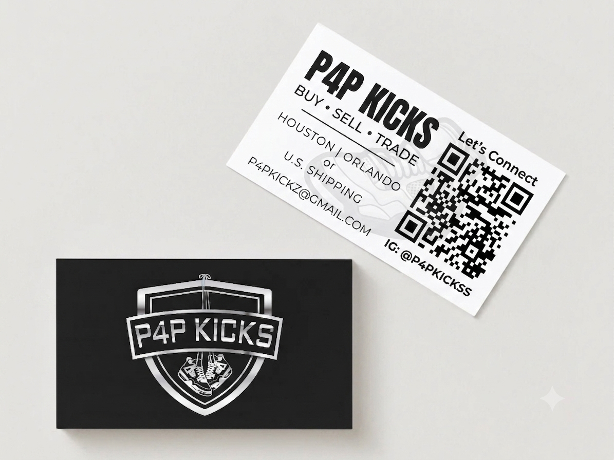
I developed a wordmark-led identity with a tight supporting color and type system, then applied it to a business card to pressure-test it at its smallest, highest-detail scale.

03 The Result

A compact, recognizable identity ready to extend across packaging, social, and print.

P4P Kicks business card design
Business card application

02 — Apparel Branding

Repent

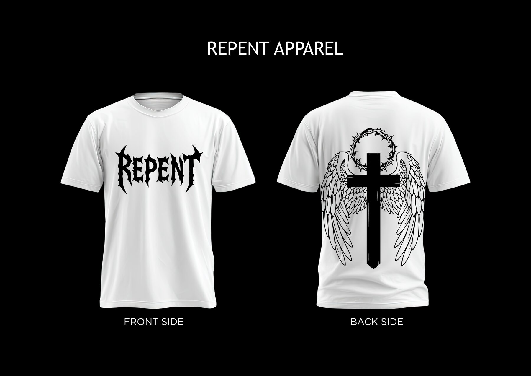
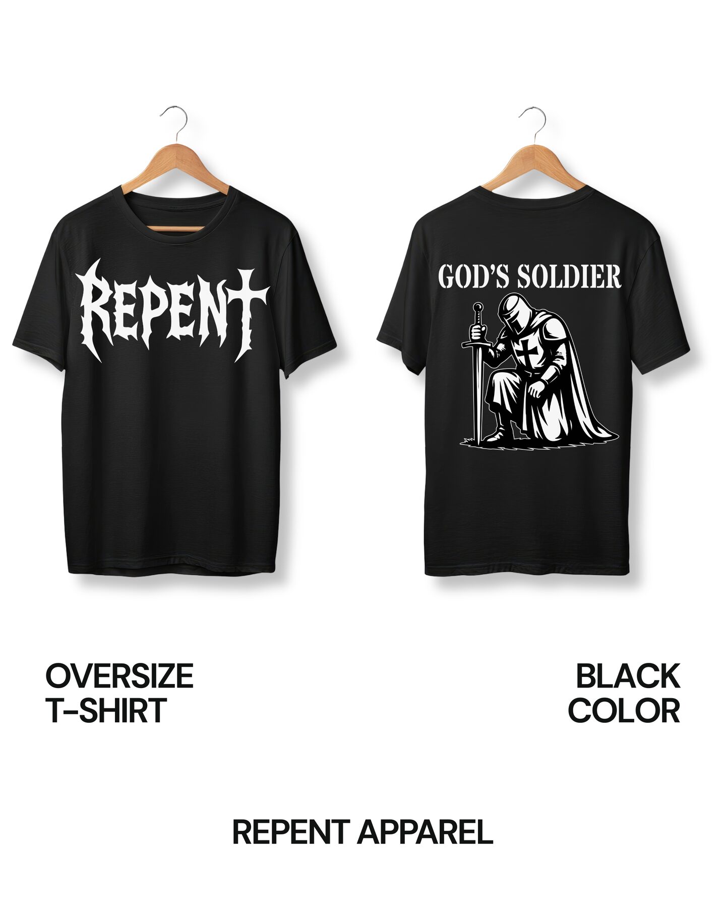
Graphic-driven identity and merch design for the apparel line Repent, spanning social content and ready-to-print tee art.

Category
Apparel Branding
Role
Graphic & Merch Design
Deliverables
T-Shirt GraphicDesign DocumentInstagram Post

01 The Challenge

Translate one graphic language across two very different substrates — screen-printable tee art and a scroll-stopping Instagram post.

02 The Approach

I designed a high-contrast, typography-driven system, then built out a print-ready design document alongside a matching social post to launch the drop.

03 The Result

A cohesive, print-ready apparel graphic with matching launch content, ready for production and release.

02 — Packaging / Rebrand Concept

Meow Mix

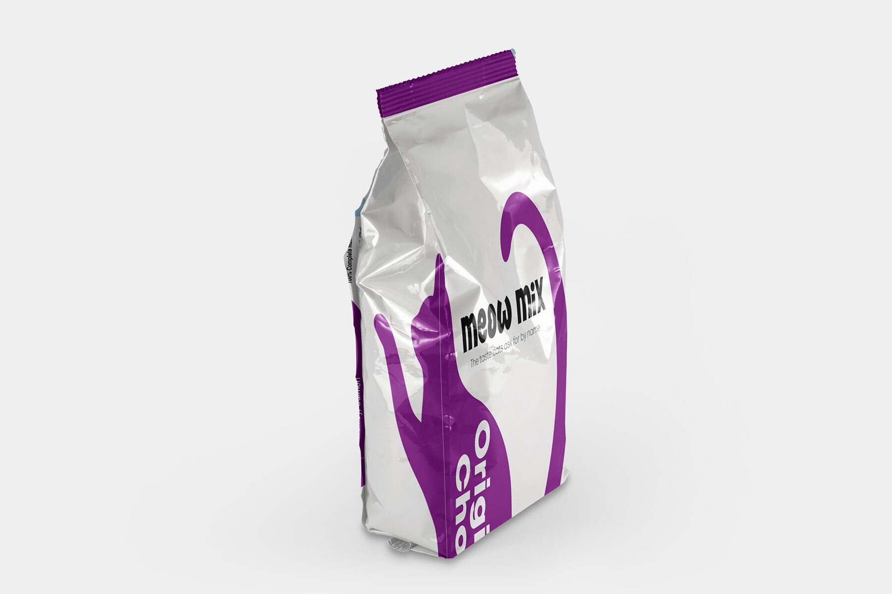
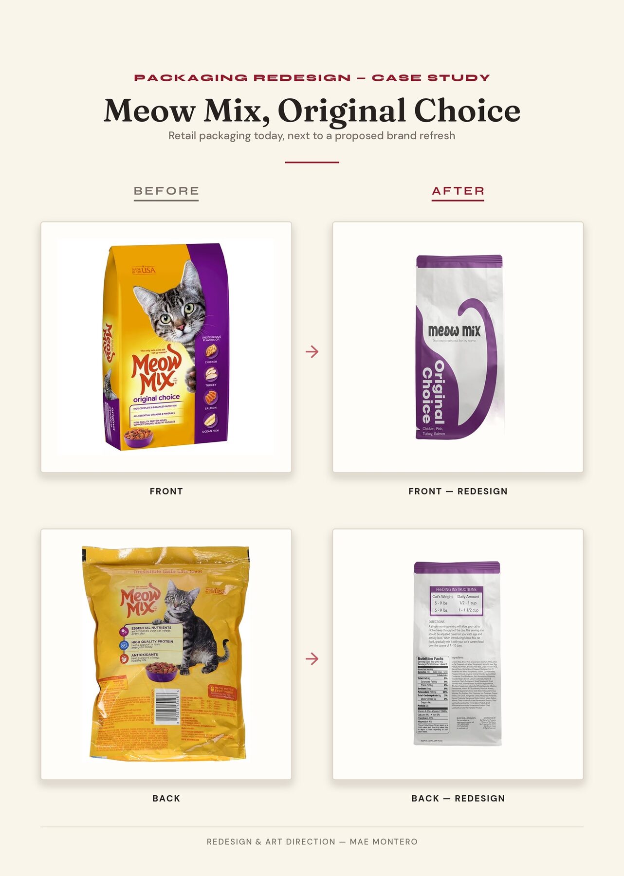
A concept rebrand exploring a fresher, more playful direction for the Meow Mix package and character design.

Category
Packaging / Rebrand
Role
Package & Character Design
Deliverables
Package RedesignCharacter RefreshBefore/After
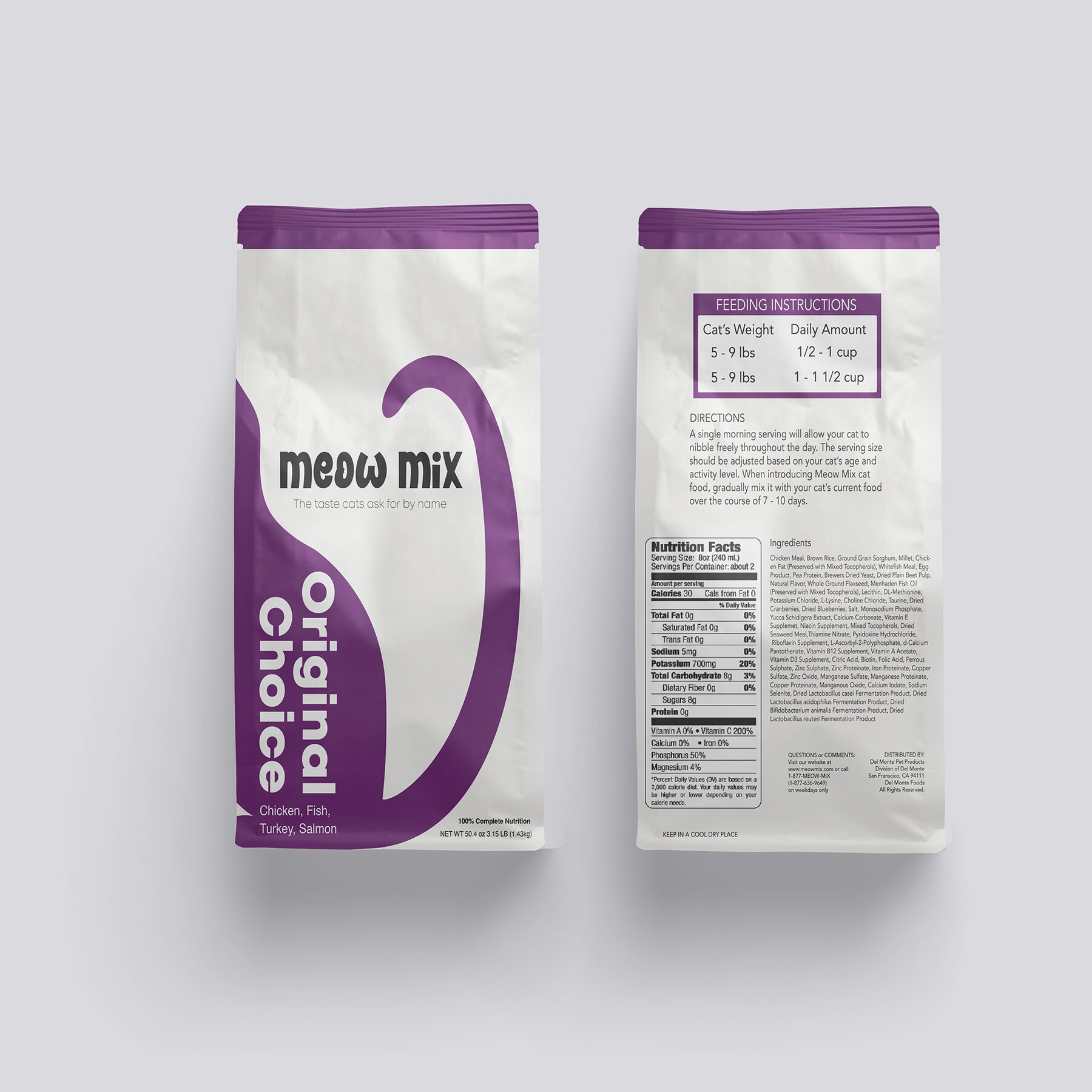
Meow Mix rebrand package design
Primary pack facing, concept rebrand

01 The Challenge

Modernize a nostalgic, highly recognizable package without losing the brand equity that makes it Meow Mix.

02 The Approach

I reworked the primary pack face and character illustration, then built a side-by-side before/after to show how much could shift while the brand stayed legible on shelf.

03 The Result

A refreshed shelf-presence concept with a clear before/after rationale for the direction.

02 — Studio Branding

Outlier Studios

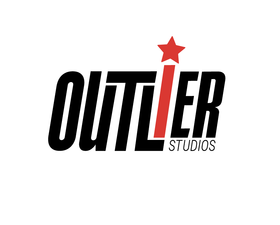
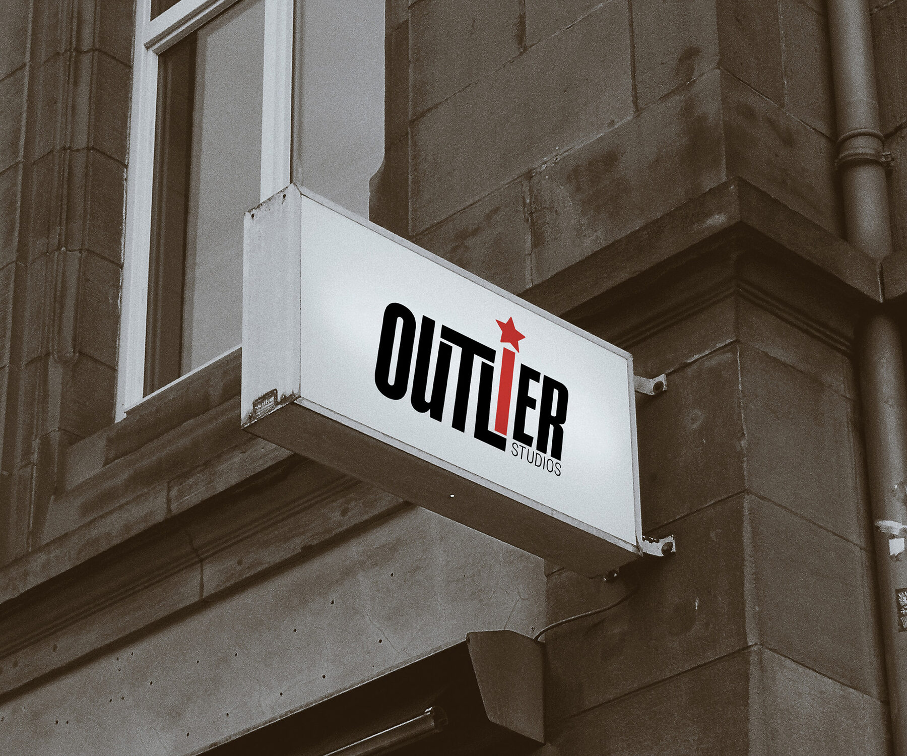
A clean, confident logo and identity system for the creative studio Outlier.

Category
Studio Branding
Role
Logo & Identity Design
Deliverables
Logo SuiteBrand Mockup

01 The Challenge

Outlier needed a mark that read as independent and a little unconventional — fitting for a studio positioning itself outside the mainstream.

02 The Approach

I designed a geometric wordmark/symbol pairing and tested it across a brand mockup to confirm it held up at different scales and contexts.

03 The Result

A versatile identity ready to anchor Outlier's broader brand rollout.

02 — Motion & Brand

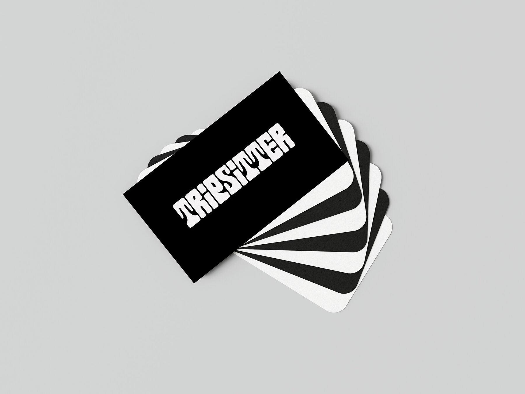
Tripsitter

A brand identity brought to life through a short motion piece, extending a static mockup into a moving brand moment.

Category
Motion & Brand
Role
Brand & Motion Design
Deliverables
Brand MockupMotion Video
Tripsitter brand mockup
Static brand mockup

01 The Challenge

Carry a distinct visual tone across two mediums, keeping the same color and type language whether the piece is static or animated.

02 The Approach

I built the core brand mockup, then translated the identity into a short animated video to show how the mark and palette move.

03 The Result

A brand system that works equally well as a still image or a motion piece.

Brand motion piece

02 — Packaging & Branding Package

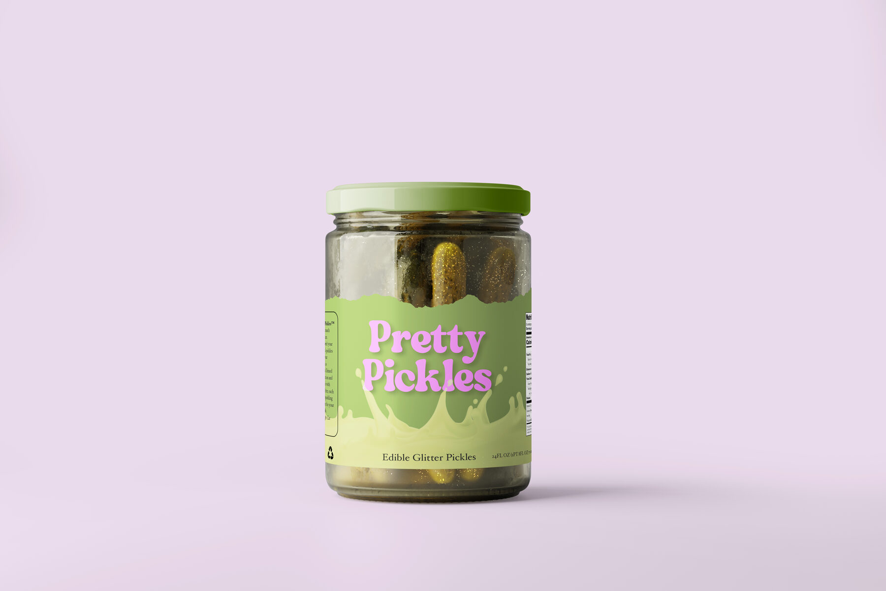
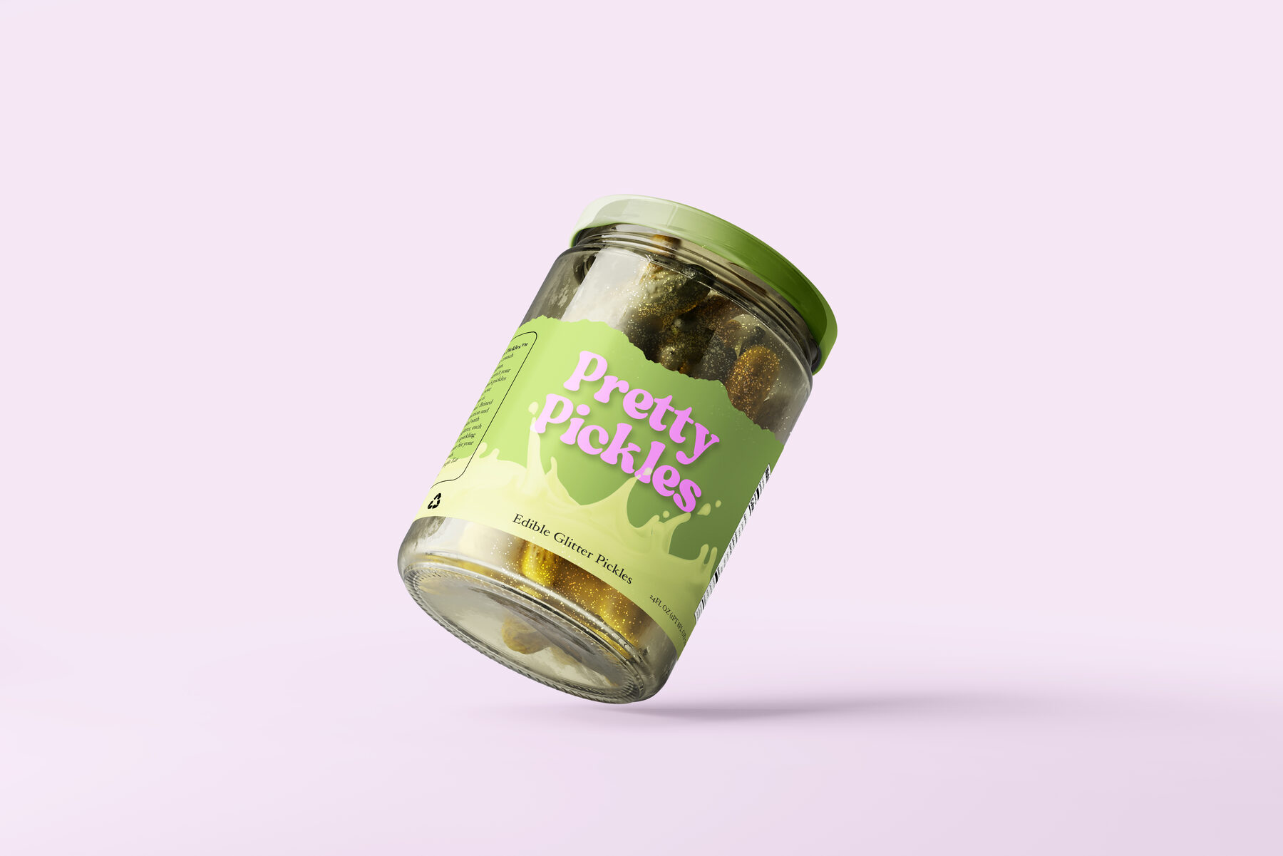
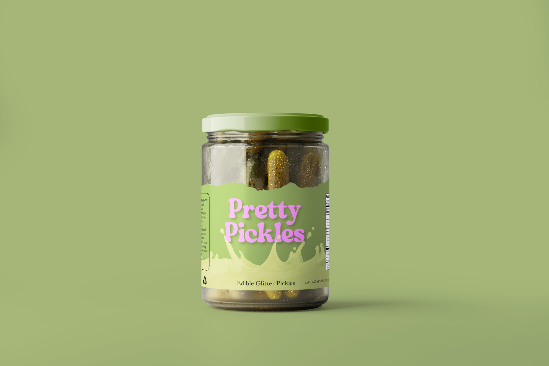
Pretty Pickles

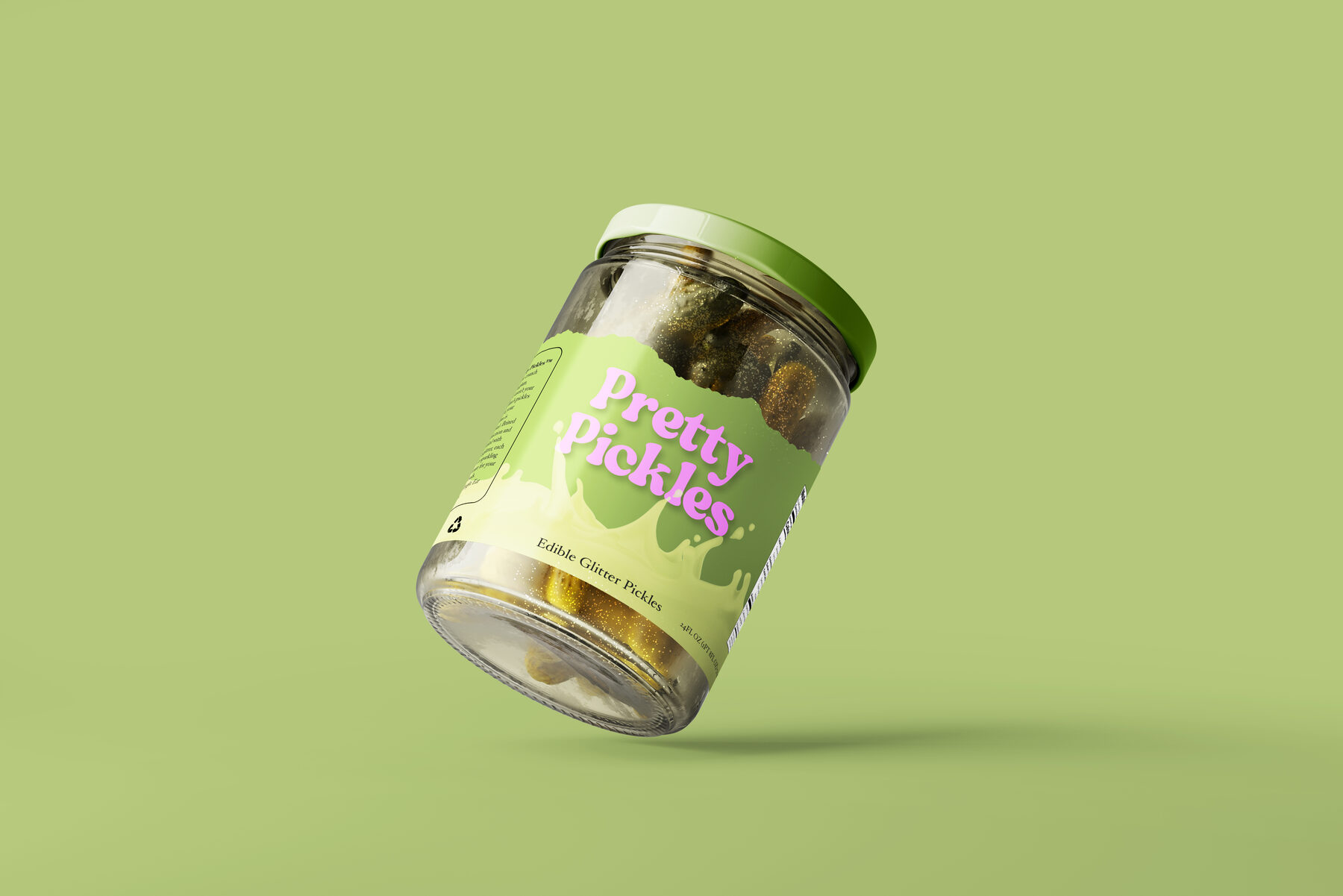
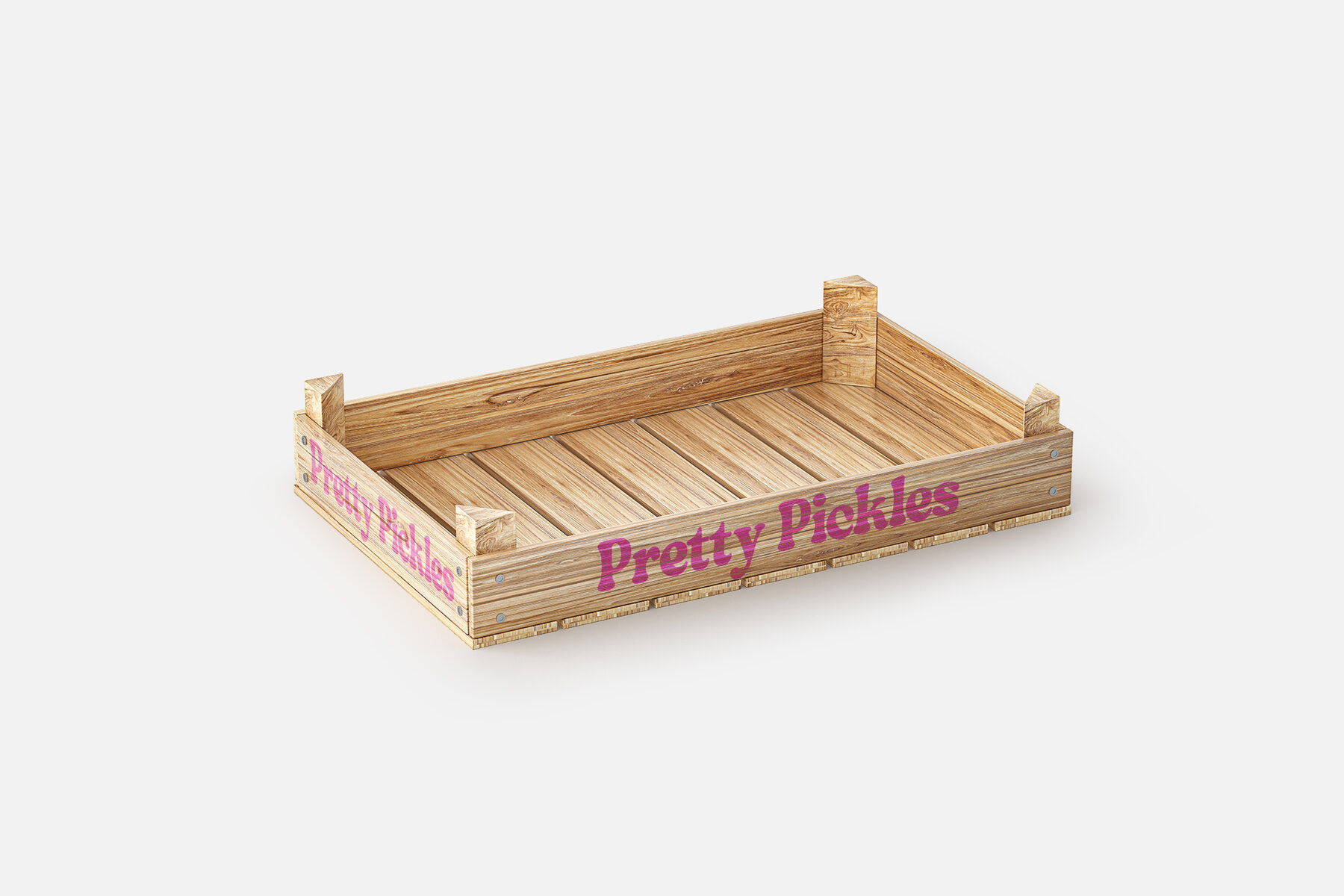
A full branding package for Pretty Pickles — packaging, crate mockup, and a complete brand guidelines document.

Category
Packaging & Branding
Role
Packaging & Brand Guidelines
Deliverables
Label / PackagingCrate MockupBrand Guidelines PDF

01 The Challenge

Design a packaging system vibrant enough to stand out in a crowded pickle aisle while staying easy to produce across labels and cases.

02 The Approach

I built out the label art on a bold pink field, then extended it to a crate mockup and compiled the full system into a branding guidelines PDF for future production use.

03 The Result

A complete, production-ready branding package spanning label, case, and guidelines.

02 — Brand Identity

Rise n' Shine

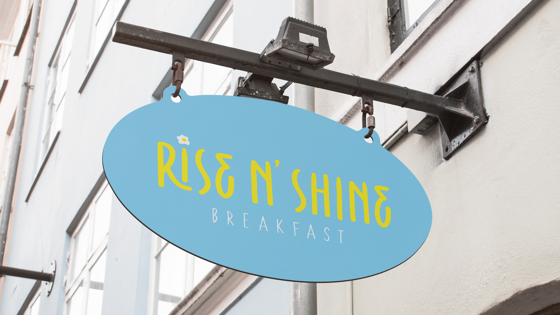
A warm, energetic identity concept for Rise n' Shine, developed across an initial mockup and a refined iteration.

Category
Brand Identity
Role
Brand Design
Deliverables
Brand MockupDesign Iteration
Rise n' Shine initial brand mockup
Initial brand mockup

01 The Challenge

Land on a mark that balanced playfulness with legibility as the concept evolved.

02 The Approach

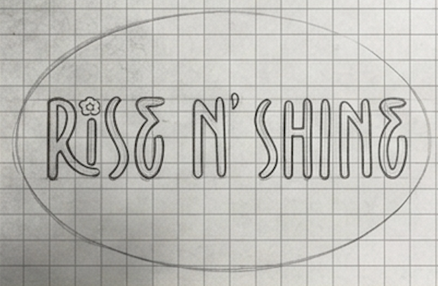
I designed an initial brand mockup, then iterated on the type and color relationship to sharpen the final direction.

03 The Result

A clear before/iteration comparison showing how the identity was refined.

Rise n' Shine refined iteration
Refined iteration

02 — Event Branding

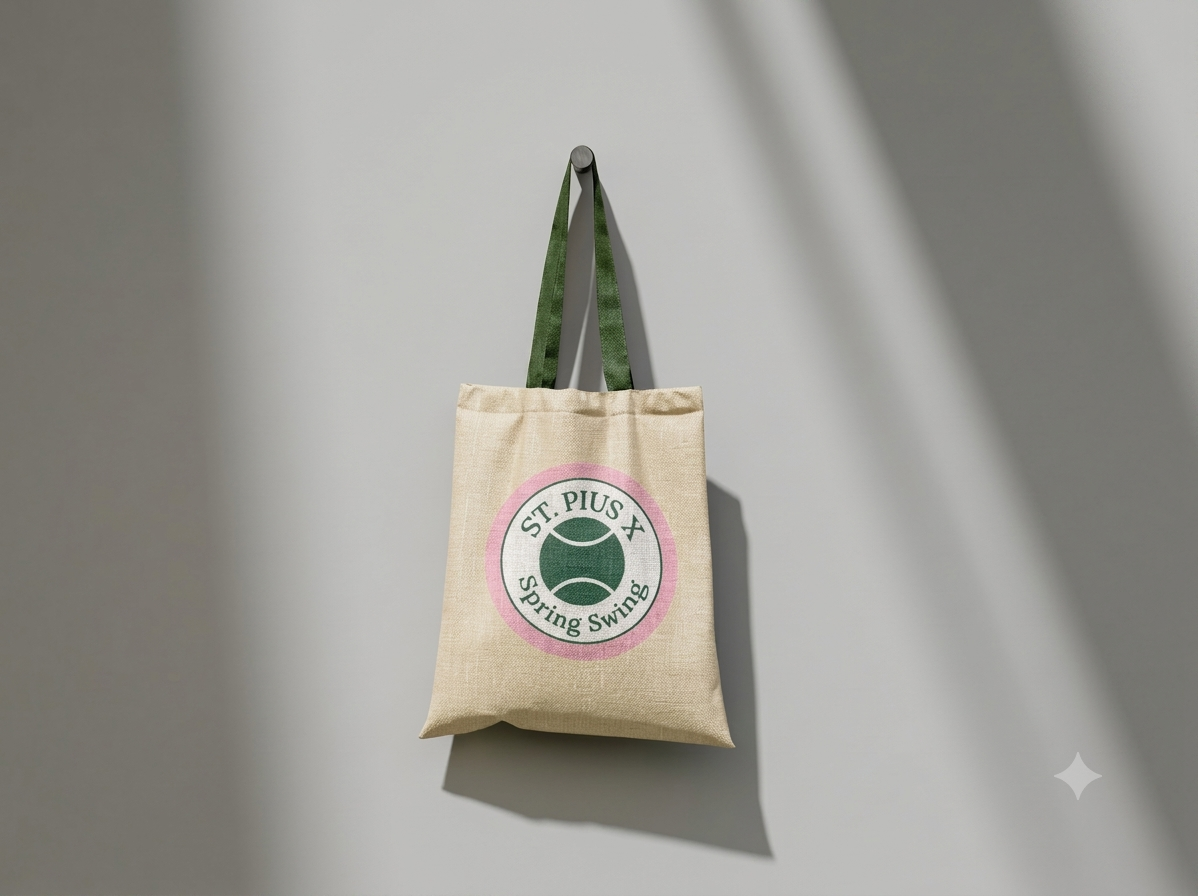
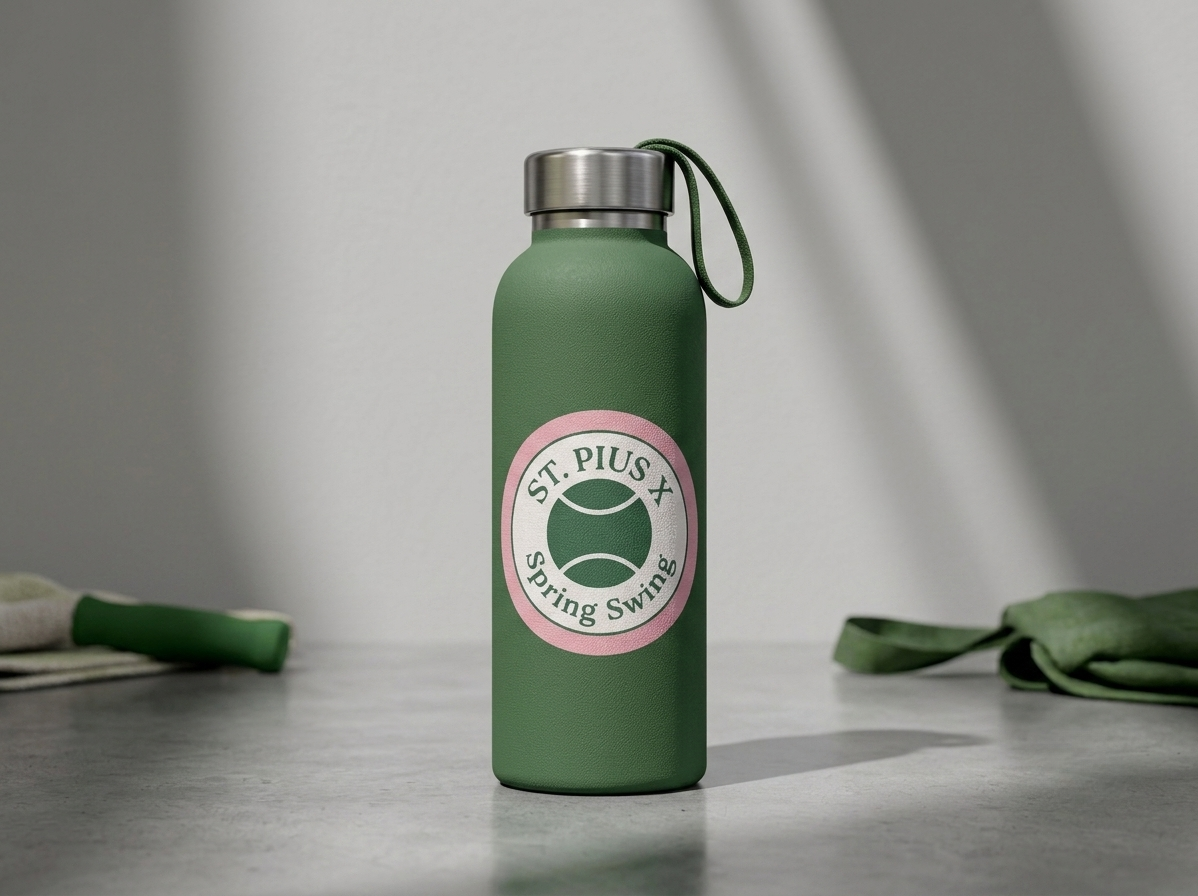
Spring Swing

Seasonal event branding for Spring Swing, designed across two mockup directions.

Category
Event Branding
Role
Brand & Collateral Design
Deliverables
Event BrandingTwo Mockup Concepts

01 The Challenge

Capture a springtime, celebratory mood while keeping the mark simple enough to reuse across formats.

02 The Approach

I explored two mockup directions to compare color and layout before settling on the strongest system.

03 The Result

A cohesive seasonal identity ready for event rollout.

03 — Print Advertisement

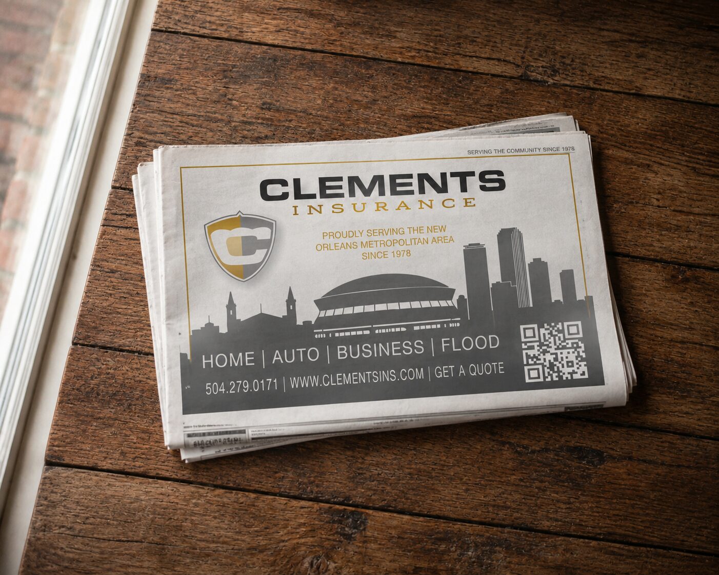
Clements Insurance Ad

A print advertisement designed for Clements Insurance, built to communicate trust at a glance.

Category
Print Advertisement
Role
Print Design
Deliverables
Print Ad Layout
Clements Insurance print advertisement mockup
Final print advertisement

01 The Challenge

Make a dense, detail-heavy category like insurance feel approachable in a single printed page.

02 The Approach

I built a layout with a clear headline hierarchy and generous white space to keep the message legible and credible.

03 The Result

A polished, print-ready advertisement mockup.

03 — Editorial / Document Design

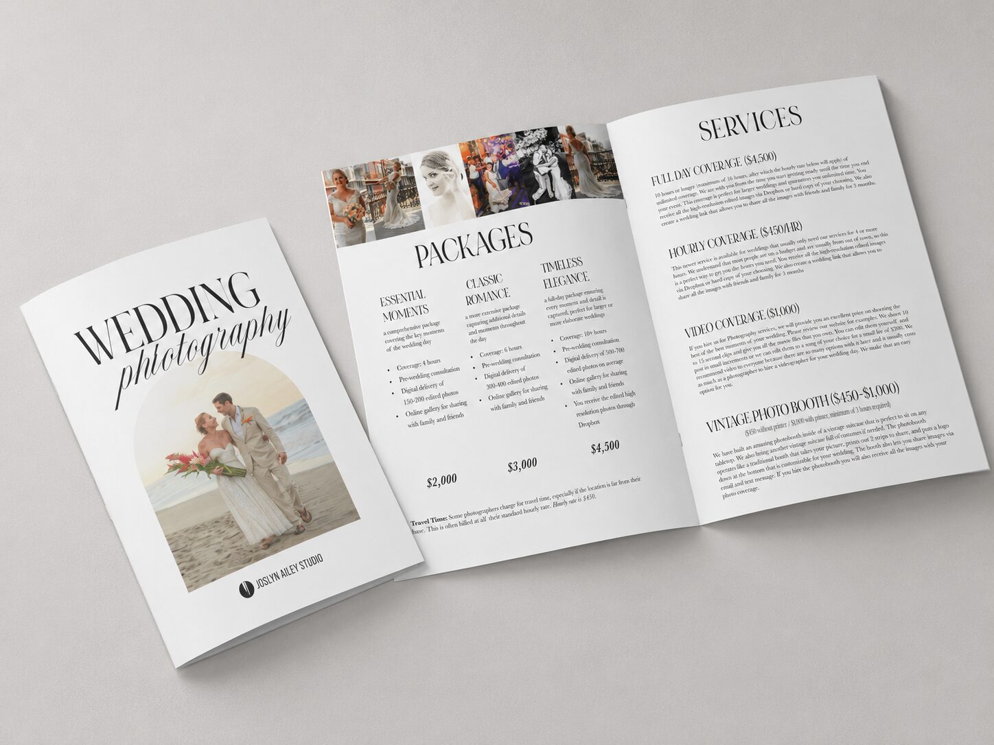
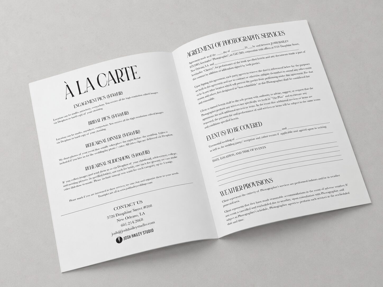
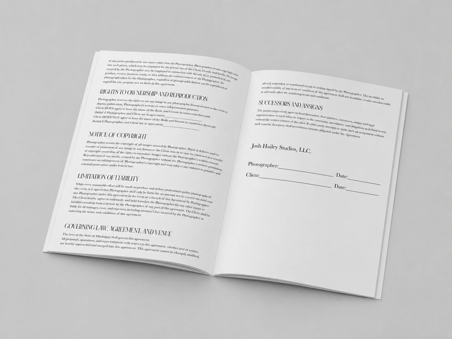
Wedding Contract

A fully designed, multi-page wedding photography contract — turning a legal document into something that reads like an editorial piece.

Category
Editorial / Document Design
Role
Document & Layout Design
Deliverables
Multi-Page LayoutCover-to-Close System
Wedding contract pages one through three
Opening pages, 1–3

01 The Challenge

Client contracts are usually the least designed part of a creative business — this project treated the wedding contract as a real editorial document, keeping dense legal language readable across many pages.

02 The Approach

I built a page system with clear section breaks, consistent type hierarchy, and breathing room, then laid it out across the opening pages, the middle sections, and the closing signature pages.

03 The Result

A polished, on-brand contract clients actually enjoy reading — the full document is linked below.

03 — Print Collateral

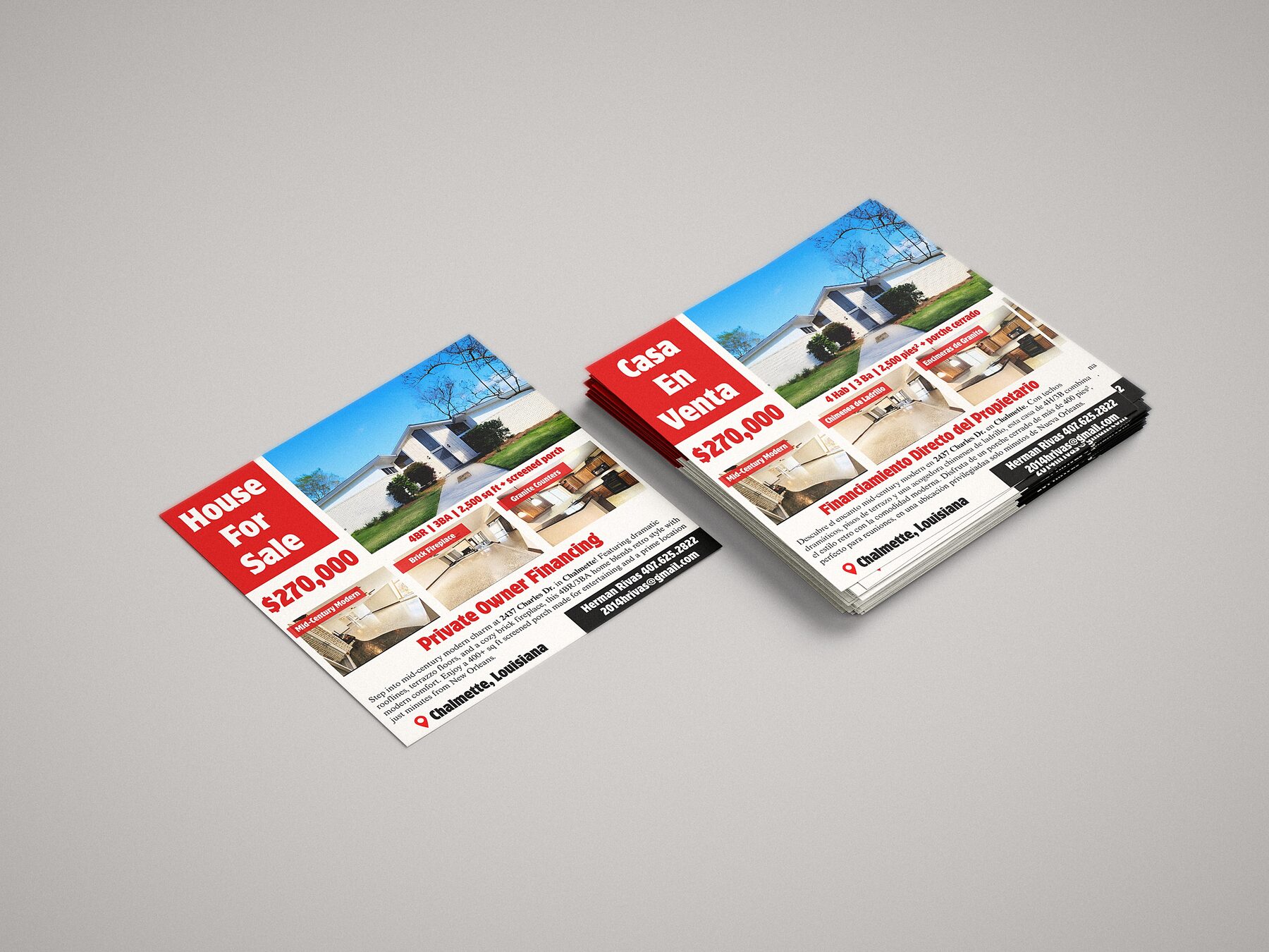
Real Estate Flyer

A bilingual (English/Spanish) real estate marketing piece designed to reach a wider range of buyers.

Category
Print Collateral
Role
Print & Layout Design
Deliverables
Bilingual Flyer Design
Bilingual real estate flyer, English and Spanish
English / Spanish flyer mockup

01 The Challenge

Fit two full languages of content into one layout without it feeling cramped or like an afterthought translation.

02 The Approach

I designed a mirrored bilingual layout so both English and Spanish versions feel equally considered and native to the design.

03 The Result

A clean, dual-language flyer ready for print distribution.

03 — Editorial Design

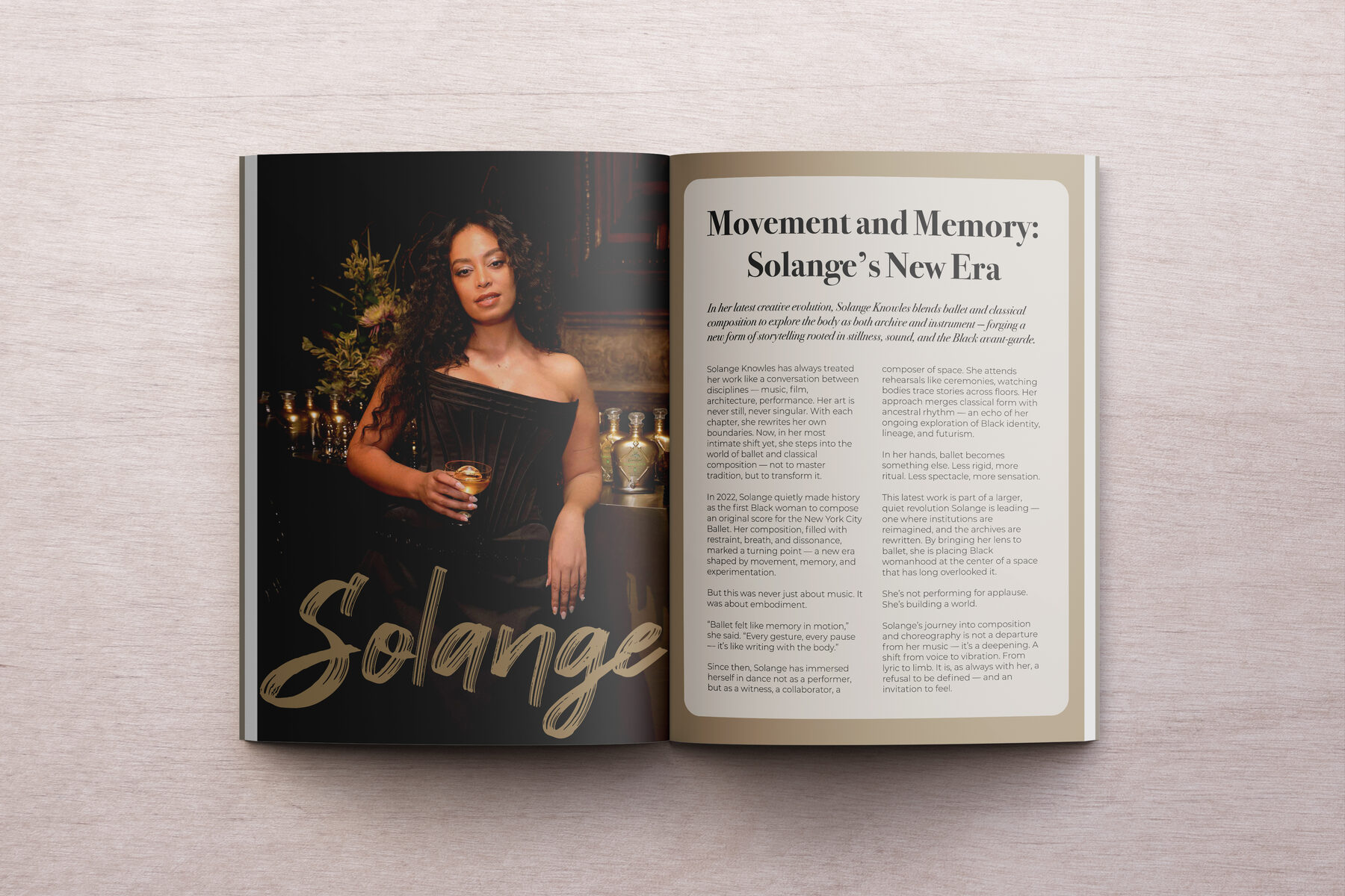
Solange: Movement and Memory

A magazine editorial spread exploring Solange Knowles' work through movement and memory as visual themes.

Category
Editorial Design
Role
Layout & Art Direction
Deliverables
Magazine Spread Layout
Solange Movement and Memory magazine spread
Final magazine spread

01 The Challenge

Let strong photography lead while still giving the spread a clear editorial point of view through type and layout.

02 The Approach

I built the final spread around a considered grid, letting imagery breathe while typography carried the narrative thread.

03 The Result

A finished magazine spread with a strong, cohesive editorial voice.

03 — Print / Stationery

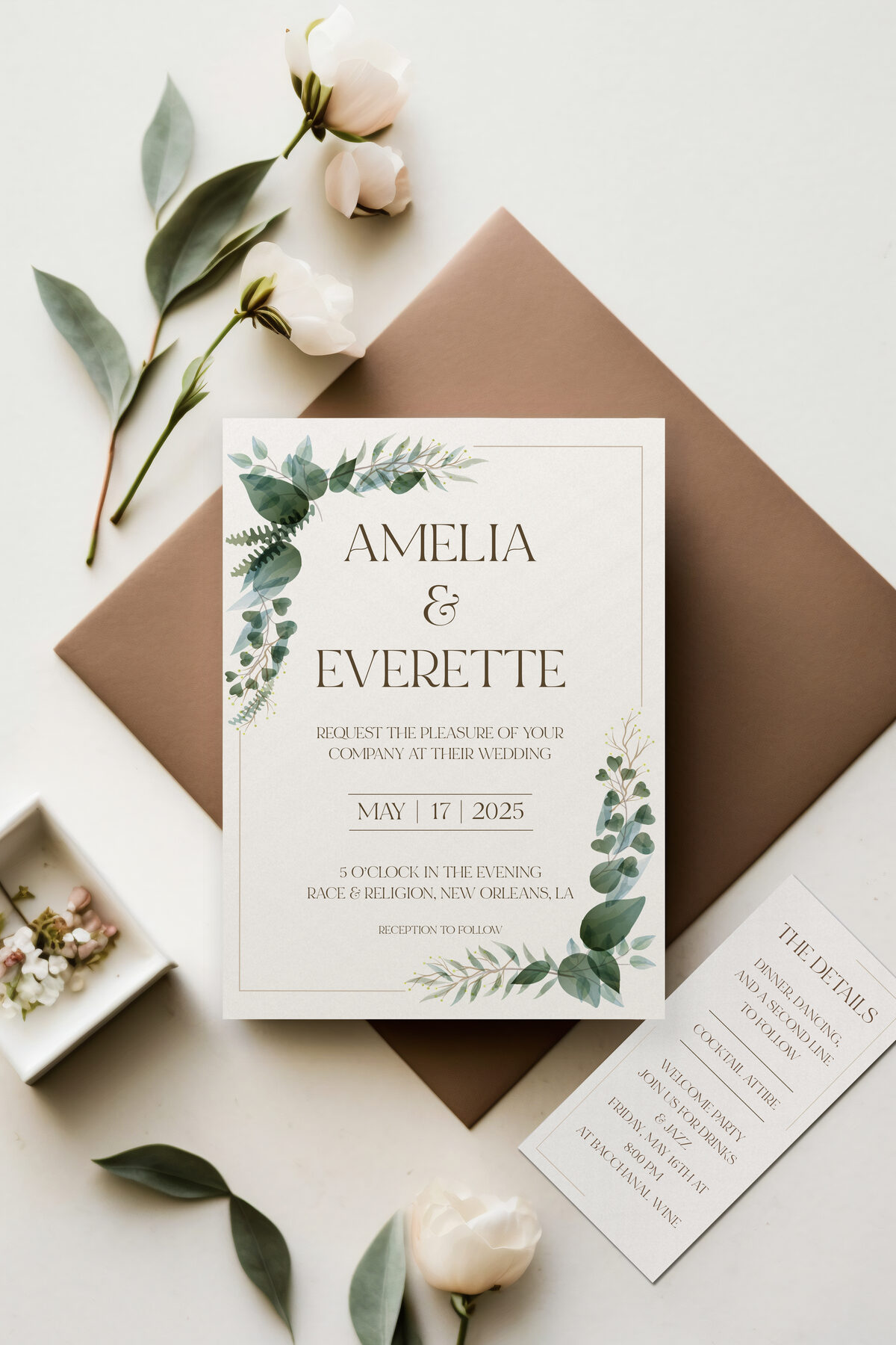
Wedding Invitation

A refined wedding invitation suite designed to set the tone for the entire event.

Category
Print / Stationery
Role
Print Design
Deliverables
Invitation Suite
Wedding invitation suite mockup
Invitation mockup

01 The Challenge

Balance elegance with personality so the invite felt bespoke rather than templated.

02 The Approach

I built a layout around considered typography and spacing, mocked up to show how the finished piece would look in hand.

03 The Result

A polished invitation mockup ready for print production.

03 — Print Collateral

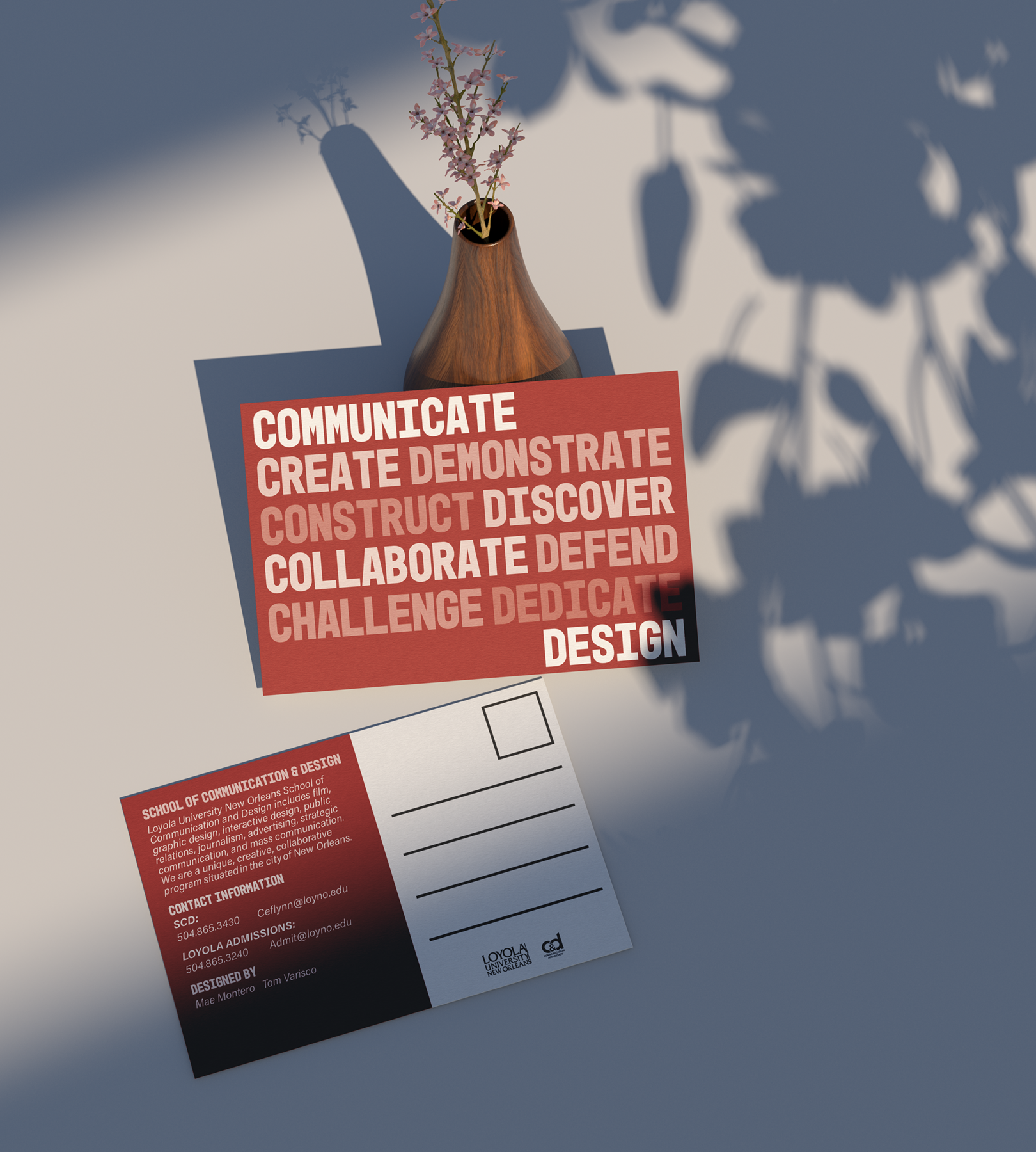
Loyola Postcard

A university postcard design created for Loyola, built to grab attention in a stack of mail.

Category
Print Collateral
Role
Print Design
Deliverables
Postcard Design
Loyola university postcard mockup
Final postcard mockup

01 The Challenge

Communicate key information fast while keeping the design distinct from typical university mailers.

02 The Approach

I built a bold, image-forward front with a clean informational back, mocked up to show the finished print piece.

03 The Result

A finished postcard mockup ready for print.